Brand consumption, the elegant way
——Riviera1920.com
Balancing information with aspiration to better serve users
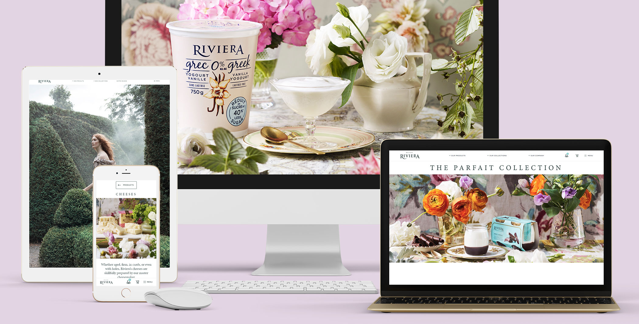
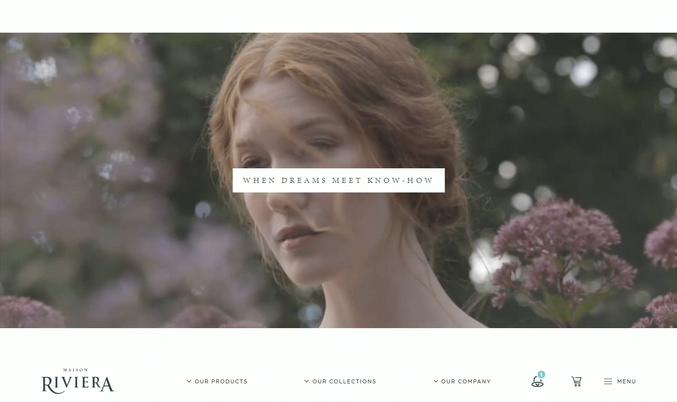
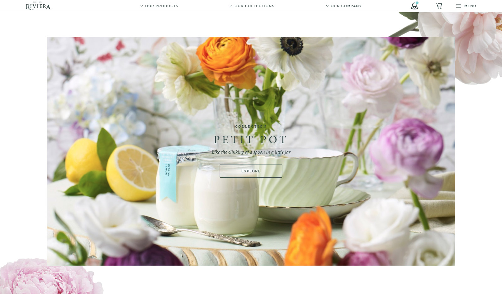
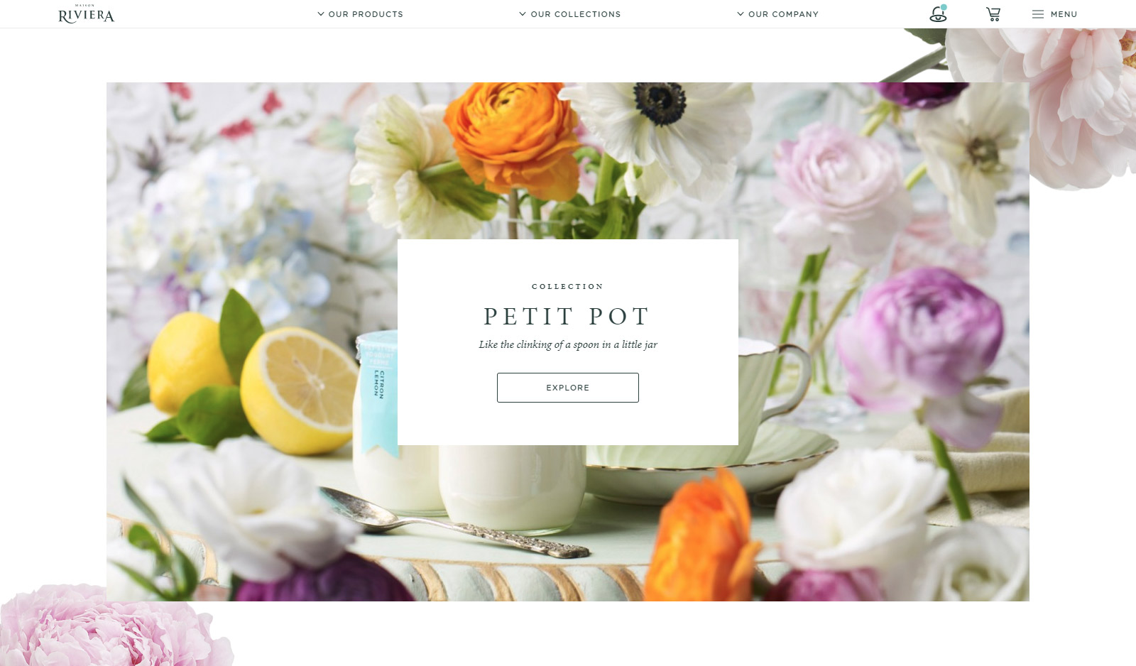
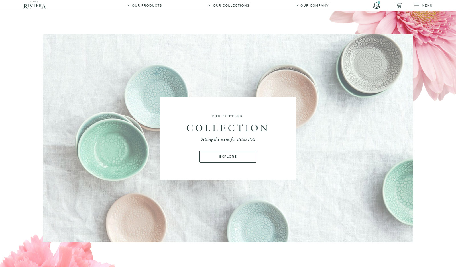
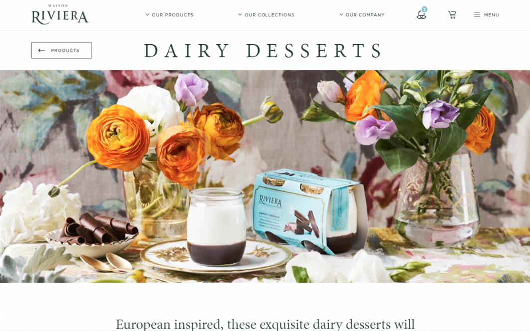
To reaffirm its position as a trendsetter in the dairy industry, Riviera wanted a new website that would draw attention to the brand and make an impression on consumers. To properly capture Riveria’s elegance, we developed a narrative platform where the brand and its products are brought to life with a dash of poetry.
Enchant, inform and engage
The objectives of this client-facing site were to compel users with an enchanting visual environment, inform them about the variety, quality and unique aspects of the products and enhance brand engagement to the point that customers ask for the products by name and are willing to go out of their way to find them.
A first taste—for the eyes
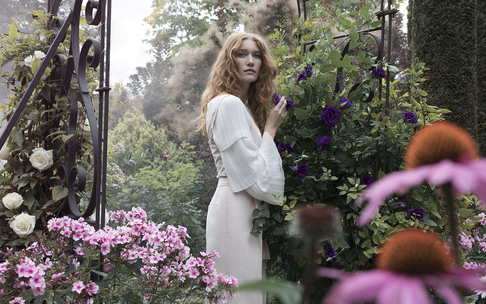
From the moment the homepage loads, users are immersed in the unique world of Rivieria, where products exist in harmony with nature. The success of this design in engaging users is evident: the bounce rate has fallen by 61% and the average time spent on page has hit 1:03 minutes.
Easy access to information
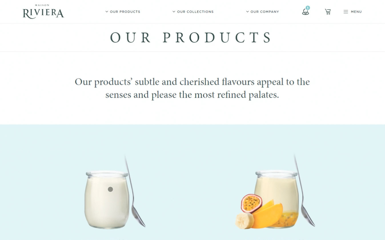
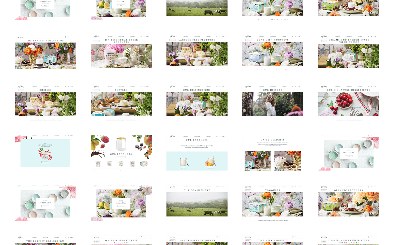
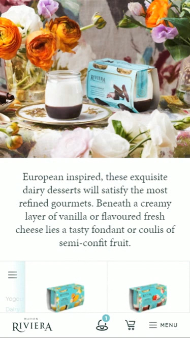
Today’s consumers are increasingly interested in nutrition and the products they eat. Brand websites need to be a comprehensive source of information. The Riviera website’s content architecture is designed to make information quick and easy to find, with products clearly organized by category: organic, GMO-free, less sugar, lactose-free, etc.
Performance and conversion
Less than four months after it went live, over 320 loyal customers subscribed to the newsletter after experiencing the new website. It also piqued the appetite of thousands of users, generating 10,315 clicks to partner sites and points of sale.
